Not all black colours are created equal, but if they look equal, like the image below...
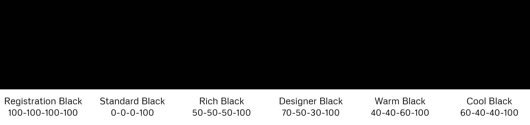
You need to go to View > Proof Colors in InDesign/Photoshop/Illustrator to witness the true horror that will be your final printed black.
The difference between these previews is that black, as viewed on your screen with light, has a much richer colour range than a commercial printer can produce using ink. That is, the Red-Green-Blue (RGB) range is much wider than the Cyan-Yellow-Magenta-Black (CMYK) range.
Note: The K in CMYK technically stands for "Key". The Key plate, in traditional colour separations, is the plate that holds the detail in the image and in CMYK printing this is usually done with black ink.
Here's the deal, standard black, as in a black that has the CMYK value of 0-0-0-100 is a pretty dull black - it's basically a washed out dark grey. It's good for one thing only - for printing fine lines and small text (more on that later). If you want your blacks to have some chutzpah, you need to dial in some CMY colours. This will give you a rich black, and while there is no standard rule for what values constitute a rich black, you're looking for something that will give you an area coverage of max 250%.
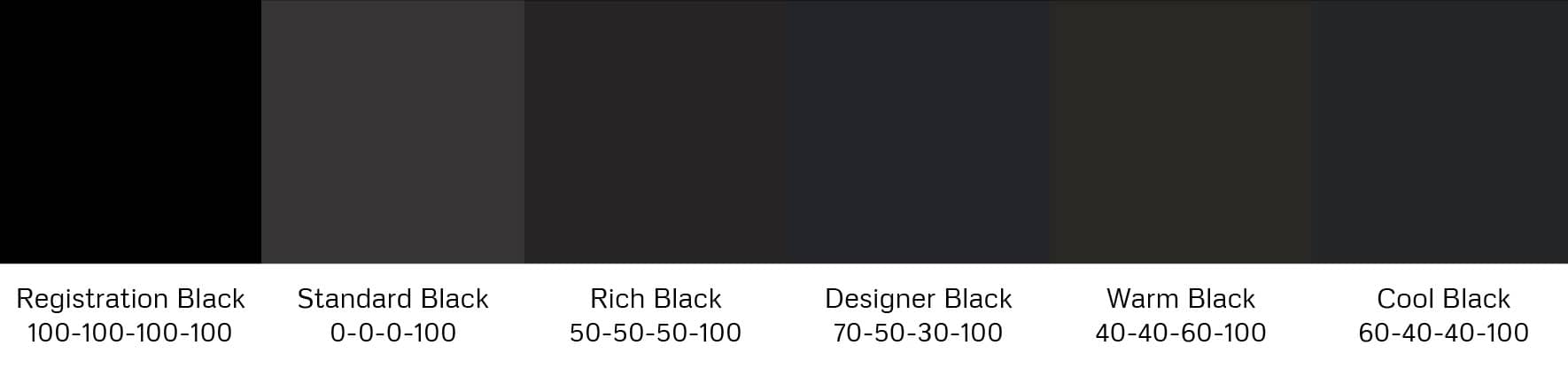
Types of Blacks
Registration Black
This one contains 100% of cyan, yellow, magenta and black (100-100-100-100). This black should be avoided as this much ink will saturate the paper it's printed on, bleed into the paper, take too long to dry, and will likely smudge.
Standard Black
This black contains only black in the output with no other colours in use. This black is best utilised for thin lines and small text. Why? If you're printing fine lines or very small text with a rich black, you will have a printer first laying down black, then going over that fine line or text again with cyan, then again with magenta and finally with yellow. Printers can vibrate quite a bit when printing and any slight misalignment that is caused by that vibration will make the colours not print exactly on top of one another. This is what those registration marks are used for when setting up a document for print - they tell the printer if any of the plates are misaligned.

So the best policy for thin lines and small text is to just use a standard 0-0-0-100 black, and your work will come out crisp.
Rich Black
A rich black will include colours from the other 3 plates. There's no set formula for this, but a good one to use is 50-50-50-100. Best practice would be to contact your commercial printer and ask them what mix they prefer you use for a rich black, and they may come back with a slightly less saturated black like 20-20-20-100. Bearing in mind how porous your paper is will also factor into your decision making for what mix of black you should use. The more porous the paper, the less ink you should use to avoid the ink bleeding into the paper.
Designer Black
This is slightly cooler in tone, but it has a really nice rich quality to it. It will be a mix of 70-50-30-100, for a total of 250% ink coverage with a cooler tint.
Warm Black
This black has more yellow in it and will have equal amounts of cyan and magenta with more yellow, for instance, 40-40-60-100, is a nice warm black tone.
Cool Black
This is a great choice for a strong black. Add equal parts magenta and yellow with elevated cyan and you got yourself a really nice looking cool rich black. 60-40-40-100 works well.
If you're not sure what blacks you have in your document, use the colour picker to determine how much ink are in the dark spots of your document. Your printer will let you know the maximum amount of ink coverage allowed. If you've gone over this threshold in spots, use a levels adjustment layer in Photoshop to pull those blacks back down.
Costs
A final note about costs. If you're using a Pantone colour as well as black - it will be more cost efficient to use a 0-0-0-100 black instead of a rich black, as a rich black will add the cost of 3 extra colours (CMY) to your job order.